Plotting in Qalculate! is done through an external program, Gnuplot. Thus Gnuplot needs to be installed separately, and found in the executable search path, for plotting to work.
To plot functions or data sets, select → , which brings up the plot dialog. The plot dialog consists of three tabs/pages — the first for the data, the second for the function range and sampling rate, and the last for control of function sampling and appearance.
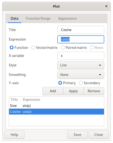
Plot functions are normal expressions that represent f(x) in y=f(x) (e.g. “sin(x)”). The x can be specified as a different unknown variable (x, y, z) or a quoted text string (actually any mathematical expression which will then be matched in the plot expression and replaced by the values on the x axis) in the variable entry below the function/data list.
To plot a data set, enter an expression that results in a matrix or vector. Select Vector/Matrix below and vectors will appear as one series and matrices will appear with each column or row (if selected) as a series, If the paired matrix option instead is selected, the first column/row of the matrix will constitute the y-values and the second the x-values.
Type in an expression, press Enter and a new window will open with the plot. The title of the series, the diagram style and smoothing of the line can also be set. The series modified must be selected in the list and to apply changes click . More series that will appear in the same plot window can be added. If the scale of the y values differ, series can be put on a secondary y-axis.
Caution
Even though Qalculate! does all the calculations before handing over the data to Gnuplot, the resulting data must only consist of pure numbers, as Gnuplot knows nothing about the functions, variables, units, etc. of Qalculate!.
For functions, the function range — min and max x value, and the number of values or the size of the step between each y value calculated — can be specified in the function range page.
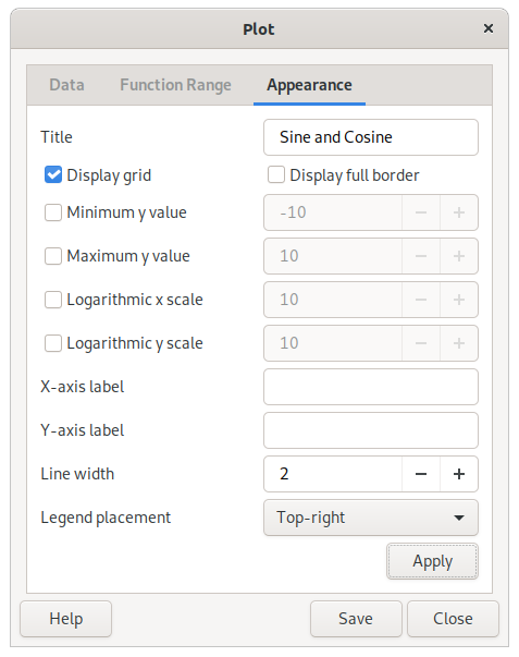
A title can be set to appear at the top of the plot, as well as labels for the x and y axis. The appearance can also be controlled by selecting or disabling legend placement, displaying/hiding the grid and borders on the top and the right side of the diagram and choosing color or monochrome graphics. The x and y scales can be made logarithmic by clicking the box on the right and filling in a desired logarithmic base.
To update the plot window, click at the bottom of the dialog.
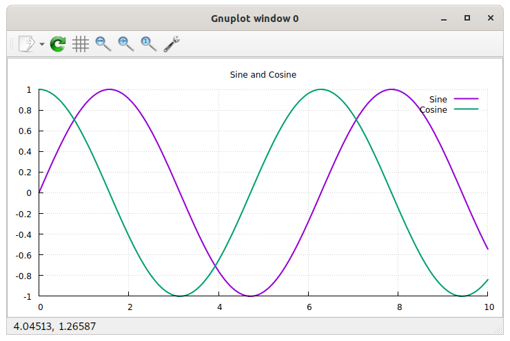
The plot can be saved as an image file. Click and select a file name and folder. The extension of the file name will decide the file type (.png for PNG image, .svg for SVG, .ps for postscript, .eps for encapsulated postscript, .tex for LaTeX, and .fig for XFig). Default is to save as a PNG image.